The Obscure Hand-Drawn Infographic That Changed The Way We Think About Cities
Why the most important health innovations sometimes come from new ways of seeing.
One of the things I’ve savored the most about the Extra Life project—telling the story of how we doubled global life expectancy—has been figuring out a way to sneak this long-forgotten, hand-drawn infographic from the 1840s onto broadcast television screens, into the pages of the the New York Times Magazine—and now, onto the main stage at TED.
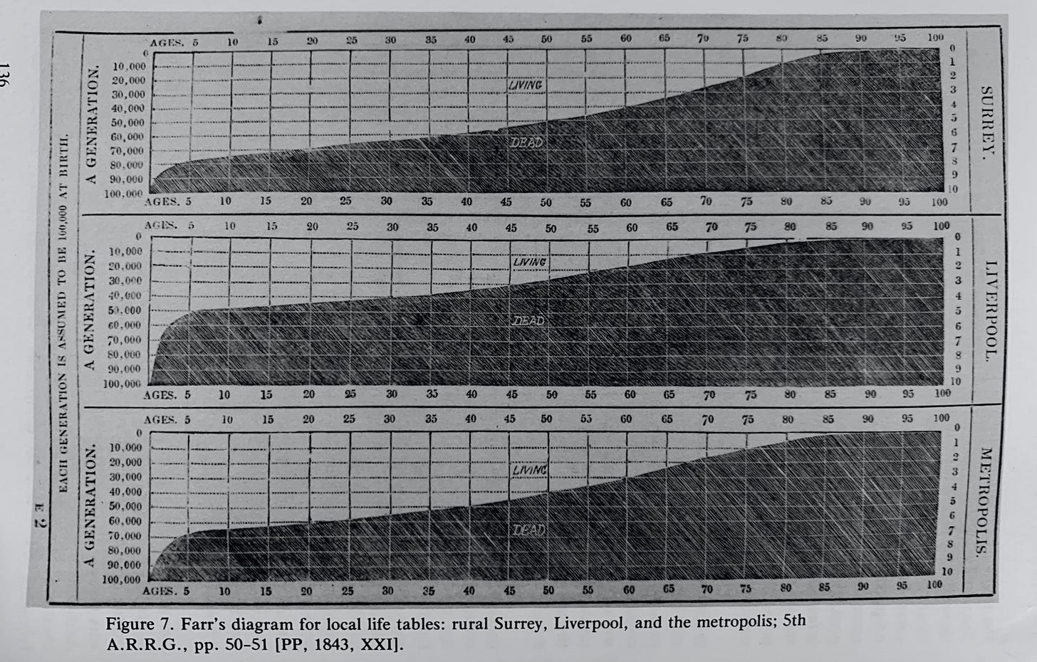
The graphic—known as a “life table”—was created by William Farr, a doctor and statistician who, for most of the Victorian era, oversaw the collection of public health statistics in England and Wales. (I originally found it reproduced in an out-of-print monograph called Victorian Social Medicine.) In the TED Talk, I only showed a segment of the original graphic; it’s actually a triptych documenting the death rates by age in three key population groups: metropolitan London, industrial Liverpool, and rural Surrey.
With these visualizations, Farr was making a definitive contribution to an urgent debate from the period: were these new industrial cities causing people to die at a higher rate? In some ways, with hindsight, you can think of this as one of the most crucial questions for the entire world at that moment. The Victorians didn’t realize it at the time, but the globe was about to go from less than five percent of its population living in cities to more than fifty percent in just about a century and a half. If these new cities were going to be killing machines, we probably needed to figure that out.
It’s hard to imagine just how confusing it was to live through the transition to industrial urbanism as it was happening for the first time. Nobody really had a full handle on the magnitude of the shift and its vast unintended consequences. This was particularly true of public health. There was an intuitive feeling that people were dying at higher rates than they had in the countryside, but it was very hard even for the experts to determine the magnitude of the threat. Everyone was living under the spell of anecdote and availability bias. Seeing the situation from the birds-eye view of public health data was almost impossible.
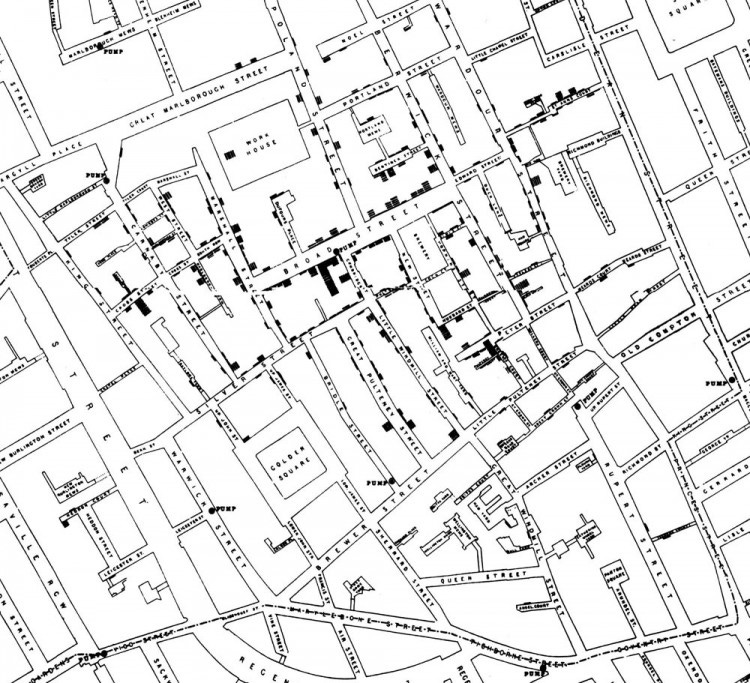
Of course, Farr’s data visualization is not nearly as famous as another hand-drawn public health document from the period: John Snow’s legendary map of the 1854 cholera epidemic, which was the centerpiece of my book, The Ghost Map.
But over time, I’ve come to think that Farr’s life table deserves an equivalent spot in the canon of information design. Because the images Farr created told a terrifying and unequivocal story: density kills.
In Surrey, the increase of mortality after birth is a gentle slope upward, a dune rising out of the waterline. The spike in Liverpool, by comparison, looks more like the cliffs of Dover. That steep ascent condensed thousands of individual tragedies into one vivid and scandalous image: in industrial Liverpool, more than half of all children born were dead before their fifteenth birthday.
The mean age of death was just as shocking: the countryfolk were enjoying life expectancies close to fifty, likely making them some of the longest-lived people on the planet in 1840. The national average was forty-one. London was thirty-five. But Liverpool—a city that had undergone staggering explosions in population density, thanks to industrialization—was the true shocker. The average Liverpudlian died at the age of twenty-five, one of the lowest life expectancies ever recorded in that large a human population.
There’s a natural inclination to think about innovation in human health as a procession of material objects: vaccines, antibiotics, pacemakers. But Farr’s life tables are a reminder that new ways of perceiving the problems we face, new ways of seeing the underlying data, are the foundations on which we build those other, more tangible interventions. Today cities reliably see life expectancies higher than rural areas—a development that would have seemed miraculous to William Farr, tabulating the data in the early 1840s. In a real sense, Farr laid the groundwork for that historic reversal: you couldn’t start to tackle the problem of how to make industrial cities safer until you had first determined that the threat was real.
I explore the long history of data and public health — including the first calculations of life expectancy, which came hundreds of years before Farr— in the the book version of Extra Life, and the “Data” episode of the TV series.


The era and impact reminds me of Charles Minard’s Infographic of Napoleon’s Invasion of Russia drawn in 1869. Incredible to see the emergence, impact and outcomes of data visualization during this period.
Oops, must stop rereading posts.